|
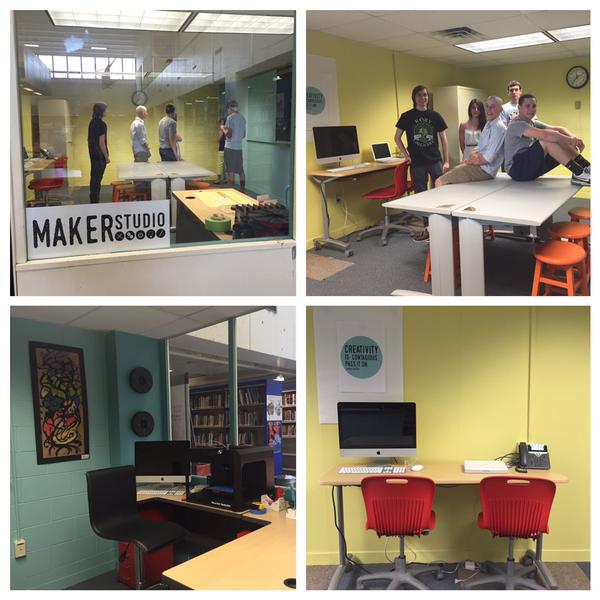
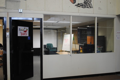
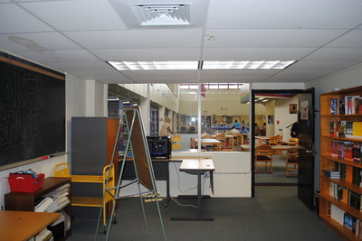
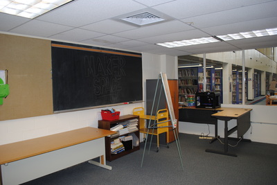
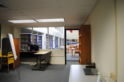
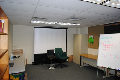
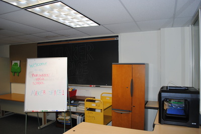
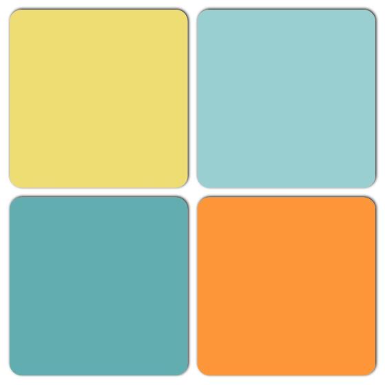
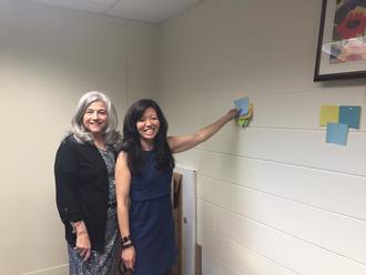
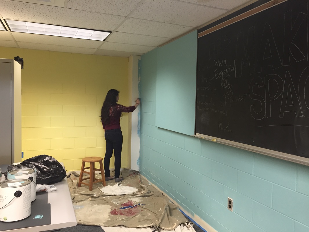
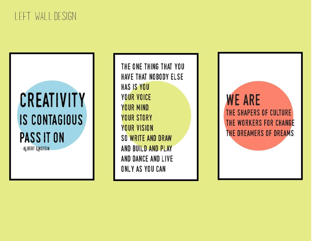
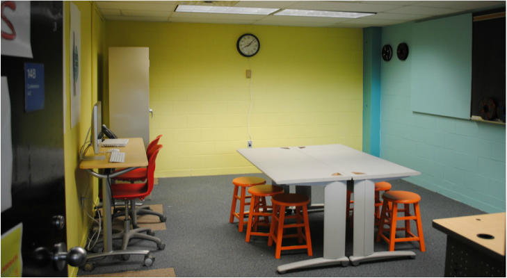
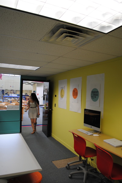
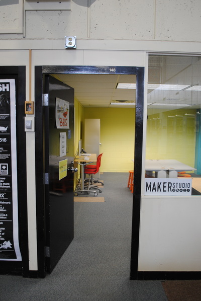
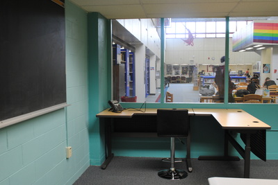
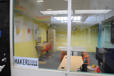
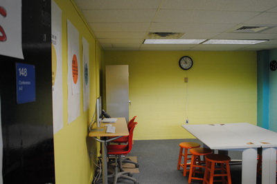
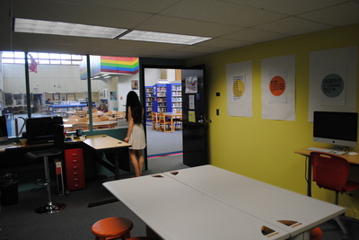
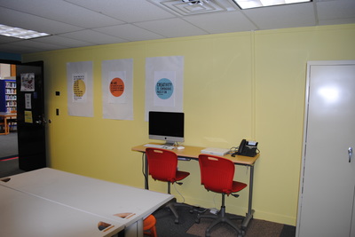
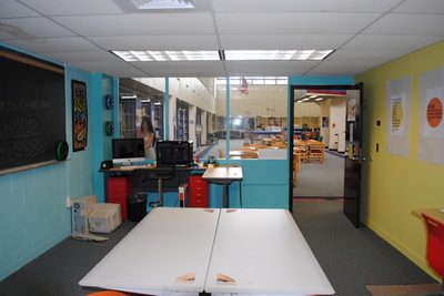
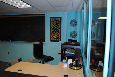
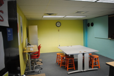
The Architecture Students Donnie Boermeester, Kevin Lynch, Ryan Ostlund, Alegria Paez, and Griffin Sullivan wrote this blog post about their final project: Our project was to remodel a room that was neglected and basically turned into a storage room that was in the back of the library next to the Help Desk room. We were asked to turn this room into a nice place for students to go and use their minds and work on whatever they want in their new Maker Studio. In this project we moved out all the desks and cabinets so we could clean, paint, and remodel the room. We had no budget but we were able to scavenge and reuse brushes, rollers, and edging tools from a previous project. The paint we got donated from a local paint store, Color Works. Here are some BEFORE pictures of the space: Before we could really begin brainstorming, we had to find out what a Maker Studio actually is. Ms. Scheffer had already shared some of her ideas for the room with us, but to properly design a functional space, we needed to research the purpose and objective of a Maker Studio. A Maker Studio is an open workshop space where students can go to share resources, knowledge, and skills. It is largely self-directed but allows for guidance from both peers and teachers. Maker Studios are very unique and useful because they give students the opportunity to experiment and learn on their own. The idea originated from art and engineering universities, where assignments typically require students to create or design things on a regular basis. To accommodate their design needs, Maker Studio workshops began popping up on campuses nationwide. Now, Maker Studios are slowly becoming more popular in the high school setting, and in our research process we looked at a few of these for inspiration. This Pinterest link has some images we felt could guide our designs: http://pinterest.com/alegriapaez98/makerspace/ We started this project by cleaning everything and prepping the walls. This included taking everything down from them and washing them down. Then we laid down paper around the whole room so we wouldn’t get any paint on the carpet. We also taped off anything we didn’t want to get painted and where two colors meet so we can get clean crisp lines. We used paint rollers for the big surfaces and brushes and edging tools for the areas a roller wouldn’t fit. Once everything was painted we moved the furniture back into the room but laid it out in a more usable way so students will have space for their minds to explore and create their masterpieces. One of our first tasks when redesigning the Maker Studio was to choose what colors we wanted to paint the walls. We wanted to create a bright and vibrant environment where students could be inspired to work on unique projects, which led us to select colors that made the room pop. Two of the walls were painted a yellow-green color called 'yellow finch', while the other two were painted 'spectra blue' and 'peacock blue', all of which were from Benjamin Moore. The final touch relating to painting was to paint the seats that students would use. Because the seats are relatively small in the room, we could choose a more intense color, which ended up being 'carrot stick' (a bright orange) which was also a Ben Moore color. The orange stools contrast with but also complement the yellow and blue walls very nicely. Special thanks to guest artist Interior Designer Deborah Chang for consulting on colors and design process. As the painting was going on, we also brainstormed words to have written on the walls that would inspire students in the room. Some of the highlights of the list include, 'explore', 'design', and 'collaborate'. These three words are particularly important because explore encourages students to think outside of the box, while design urges them to bring their ideas to fruition. Collaborate is also important because working with others and throwing around ideas is an amazing way to come up with new and better ideas. We also collaborated (see what I did there?) With a guest designer, Ms. Vigneau, to come up with a logo for the room that could be placed on the front window. The logo is black to contrast from the rest of the room, and also because it's easy to read from a distance, which could draw students in to see what the Maker Studio is all about. Here is the logo and posters that we selected to go in the room: The Maker Studio of Burlington High School was designed for many wants and needs. The main client for the room was Ms. Scheffer, BHS's Mobile Learning Coach and Technology Integration Specialist. At BHS, Ms. Scheffer originated the whole idea of a Maker Studio. Her idea for the Maker Studio was based around the students of BHS. The Maker Studio would be next to Burlington's Help Desk, where technology problems are solved and students provide recommendations on the best technology to integrate into the classroom. Burlington High has tried a new view on learning, such as integrating iPads with students and their classes, and is a 1:1 school. This means that every student at BHS has an iPad. Ms. Scheffer wanted a colorful and vibrant space that produces energy in the people who walk in the space. The idea was to give the viewer a bright and happy environment that promotes creativity and innovation. The room was given cool and popping colors to keep kids motivated to work but to also have fun in that space. In the Maker Studio we had to have a table in the middle for work, such as kids working on projects or teachers having a meeting. We also had a wall in the room where a projector screen could go for a presentation or meeting. On a separate wall we had a bulletin board that we touched up, which will be used to present kids work and show off new ideas. Also on that wall is a chalkboard that will be used to show creative ideas and drawings that the kids create. The creation of the newly updated Maker Studio was not an easy feat. The task required a lot of hard work and dedication. For the Maker Studio, we began by moving all of the furniture out of the room. We got right down to painting using moeBenjamin Moore paint. We had to shift the furniture around in order for the maker studio to seem more open. We shifted the desks and tables around the room in order to create more space for artists looking to use the space. We had a strict plan due to the fact that the studio had to include certain furniture and equipment. Therefore, instead of moving this stuff out of the room completely, we had to rearrange it to make the space more appealing. We finished the area by cleaning and wiping down the only window. The only furniture we added were orange stools for sitting and to add more color to the room. Afterwards, we talked to Ms. Vigneau, a graphic designer, in order to come up with different font texts for creative quotes and labels. We came up with different fonts in order to label the maker studio and to add inspiring quotes around the room. The Maker Studio was updated in order to improve the overall appearance and to add more spaces in our school for students to work peacefully. It took a lot of time and hard work, but in the end we achieved our goals in improving the space. Here are pictures of the (almost) completed space: Here is what the students had to say about the project and experience: "It taught me how to open up a room and make it look appealing"
-Griffin "It helped us learn how to organize and utilize space"-Kevin "It helped us to learn time management"-Donnie "It was fun to learn how to maximize efficiency in a given space" -Ryan "This project taught me how to work carefully, and take the time to see every aspect of the design was up to par.”-Alegria
0 Comments
Leave a Reply. |
AuthorChristina Chang teaches art and design to students in grades 9-12. Burlington Public Schools
|

 RSS Feed
